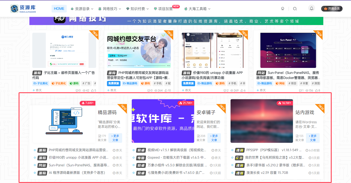
这是一个子比主题小工具分类聚合卡片,子比自带的卡片上移我感觉有点不怎么好看,也是我感觉吧,今天就给聚合卡片上移一下,让他能够更美观一下,我在这里说一下,本篇文章我测试的手机的话会不适配,然后手机端隐藏了,然后就是只有PC显示,喜欢的就美化一下吧!
演示截图
代码部署
这个是子比的小工具的美化:外观-小工具-Zibll 专题&分类聚合卡片,将下面的代码放到自定义CSS即可
.term-aggregation .term-img {
  width: 18.5em;
}

.graphic,
.page-cover {
  margin-top: -40px;
}

@media screen and (min-width:1024px) and (max-width: 1240px) {
  .term-aggregation .term-img {
    width: 19.8em;
  }

  .em14 {
    display: none !important;
  }

  /*.text-ellipsis-2 {display: none !important;}*/
}

@media screen and (min-width:768px) and (max-width:1023px) {
  .term-aggregation .term-img {
    width: 14em;
  }

  .em14 {
    display: none !important;
  }

  /*.text-ellipsis-2 {display: none !important;}*/
}

/*隐藏否则不显示标题*/

@media screen and (min-width:425px) {
  .clearfix {
    padding-top: 20px;
  }
}
如何向让缩略图的尺寸变高可以这么修改,
.term-aggregation .term-img {
  width: 18.5em;
}
修改为
.term-aggregation .term-img {
  height: 200px; /* 例如设置固定高度 */
}
但是请注意,这可能会导致图片变形(如果宽高比不一致)。因此,更推荐使用以下方法之一。
.term-aggregation .term-img {
  width: 18.5em;
  height: 200px; /* 设定你想要的高度 */
  object-fit: cover; /* 图片会裁剪以填充容器,保持比例 */
  /* 或者使用 contain 来保持完整显示,但可能留白 */
}